B2B Saas App & Design system
Web application redesign & testing for a B2B ad marketplace and management platform.
Project description
Our team at Moment Studio partnered with ADmyBRAND's founder and CEO to conduct usability testing and redesign key features of their web application, offering omnichannel advertising and campaign management. The project aimed to uncover early user feedback on the existing designs and redesign core flows to increase user engagement and streamline the advertising process, from tracking analytics to ad campaign management.
Background
ADmyBRAND is a comprehensive B2B vertical marketplace and an all-in-one web solution for booking and managing ad spaces across various mediums, from TV to digital. The app and web platform offer tools to create, plan, book, manage, and analyze omnichannel ad campaigns. The company has a base of over 12,000 active users in India and recently began expanding into the US & global markets.
My Role
As the lead Product Designer, I played a crucial role in collaborating with a project manager and a team of 3 UX/UI designers. Together, we led the end-to-end design process from testing through design and handoff, ensuring the project's success.
Timeline
4 months
Impact
The final deliverables included a comprehensive usability test findings report, updated sitemap, high-fidelity mockups, prototypes, a UI style guide, and design system updates.
Following the redesign, our preliminary testing findings showed a 20% increase in average task success rates and an increase in average NPS score from 30 to 80. This indicates a notable improvement in usability and user satisfaction.


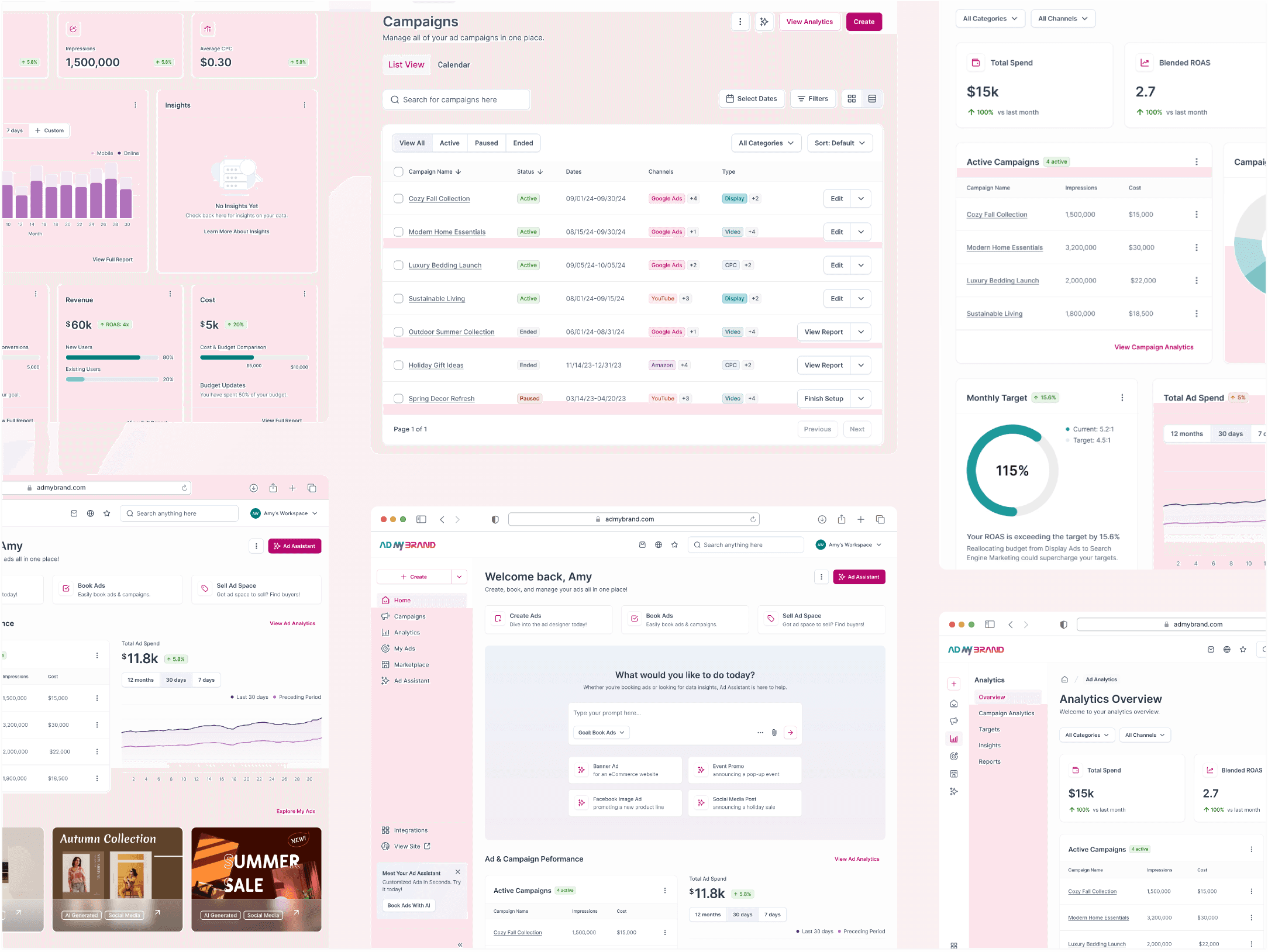
Intuitive navigation & Personalized homepage Redesign
Homepage redesign featuring updated navigation and responsive modular layouts.

Ad & campaign analytics
Redesigned ad analytics dashboard with improved filtering and data visualization components.
Process
The redesign was focused on the logged-in experience for existing users across five user flows and three critical product features. To clearly define the pain points & targeted outcomes, we conducted an initial round of usability testing using the existing designs, followed by a design phase and a second round of testing to measure outcomes.
Discovery
I created a discovery questionnaire and worked with the client to outline the following core goals and business objectives:
Increase user acquisition (particularly among small to medium-sized businesses)
Improve conversion for booking ad campaigns
Identify user interest in an ad analytics dashboard (feature adoption).
Improved site navigation across the marketplace and analytics dashboard for logged-in users.
Feature AI-driven tools like the ad creative generator to determine user interest and market fit.
Usability Research & Testing
We conducted 2 rounds of unmoderated usability testing using Lookback.io, before and after the redesign, with a total of 10 users. We also collected survey responses to gather relevant qualitative and quantitative metrics. This comprehensive approach allowed us to identify design priorities and measure the effectiveness of our redesign in improving ad campaign booking, managing ad analytics, and tracking/managing ad campaigns.
The initial round of testing (pre-redesign) indicated that the most common pain points were confusing navigation structure, limited data analytics, and difficulty finding active campaigns. Over 60% of users also indicated that a centralized "hub" for personalized content like ad inventory and marketplace offerings would be helpful.
The second round of testing (post-redesign) highlighted significant improvements in average test success rates and user satisfaction (see the "Results" section below for details).
Design
Based on round one of usability testing, we determined that the redesign would target the information architecture related to navigation and page layouts, the homepage, analytics dashboard, and campaign management features.
To manage the sprint and project timeline constraints, I worked out a plan with the client to backlog initially planned design updates for the AI features (chat-based ad creative generator). This ensured our team could stay nimble and focus on redesigning or adding foundational elements from global navigation to analytics dashboard layouts and filtering.
Results
Usability testing with a small sample of users following the redesign showed a 20% increase in average task success rates when navigating from the homepage to analytics and campaign management.
The average NPS score also increased from 30 to 80 following the redesign. This indicates a notable improvement in user satisfaction. 100% of the users expressed satisfaction with the UI updates, noting that the visual design was easy to scan and appealing while balancing warm tones with a modern look.

Usability Testing Survey
We collected survey responses from 10 participants to gather qualitative & quantitative usability metrics.

Unmoderated Testing Sessions
The image shows a screenshot of an unmoderated session on Lookback.io during the second round of testing (post-redesign).
Solution
Our team redesigned five user flows and three critical product features. I also lead updates to the design system and UI style guide as part of the design phase. Based on round one of usability testing, we determined that the redesign would target the information architecture, mainly related to navigation and page layouts, revamping the homepage (existing users), analytics, and campaign management. Below is a summary of some key design updates that I led during the project:
Homepage & Navigation
The new homepage provides a centralized "hub" with a customizable modular layout. Quick links and a well-structured sidebar menu help users access necessary actions, from booking ads to viewing campaign analytics. Intentionally placed CTAs across the page encourage users to explore the AI Ad Assistant and ad marketplace offerings.
Seamless Ad Analytics
I redesigned the analytics dashboard and related pages. The focus was restructuring the navigation IA to feature relevant campaign and ad analytics across all categories. Improved data visualization components and tables help users filter based on ad campaign status and dig deeper into data insights across ad types and channels.
Easy Ad Campaign Management
The new design makes accessing important data analytics for ad campaigns straightforward from the homepage to the dedicated analytics dashboard. A campaign management page makes editing and tracking active versus inactive campaigns easier - a key pain point identified during testing.
Results
I took the lead in conducting a second round of usability testing to measure the impact of redesign and pinpoint future design opportunities. The initial results showed exciting improvements in task success rates and user satisfaction. In the future, testing with a larger group of participants will be essential to ensure a representative sample size.
Increased Efficiency
There was a 20% increase in average task success rates across all user flows, from searching for relevant ad data to filtering and locating crucial metrics to determine ad campaign performance.
Improved User Satisfaction
The average NPS score went from 30 to 80 following the redesign. This indicates a significant boost in user satisfaction!
Positive User Feedback
100% of users reported satisfaction with the updated UI, noting the "clean" look and pleasant use of brand colors to highlight important information.